Havergal College IA Redesign
Information Architecture Redesign
This project was part of my IA (information architecture) course where we re-designed the primary navigation IA of a website after a heuristic evaluation. My group selected the Havergal College independant school website.
Problem Space
Role
UX Designer/Researcher/IA Architect
Team
Myself
Taamanaae Taabaassum
Abigail Colmenar
Lubomyra Leong
Time & Duration
Fall 2020 (9 Weeks)
The Problem
Representative users struggle to navigate to the information they are seeking on the website. Because the current information architecture is unclear, misleading and does not transparently represent relevant information.
The Solution
Our team redesigned the global navigational schema of the Havergal website in order to streamline the user experience by clarifying the content and having it be easier to understand for the user. The redesign sought to clarify the unclear, organize the disorganized and relied upon the users experiences to guide the solution.
Research
Secondary Research
Primary Research
We completed a heuristic evaluation on the current website and aimed to adress the obvious problems.
We conducted a survey (20 participants) and semi-structured interviews (5 participants) on the current website to evaluate what the big issues on the site were. Interviewees were tasked with perusing the desktop site and with finding enrolment, tuition information, financial assistance and boarding accommodations. Most participants struggled with the unclear and ambiguous secondary navigation headings and were not able to easily find relevant information.
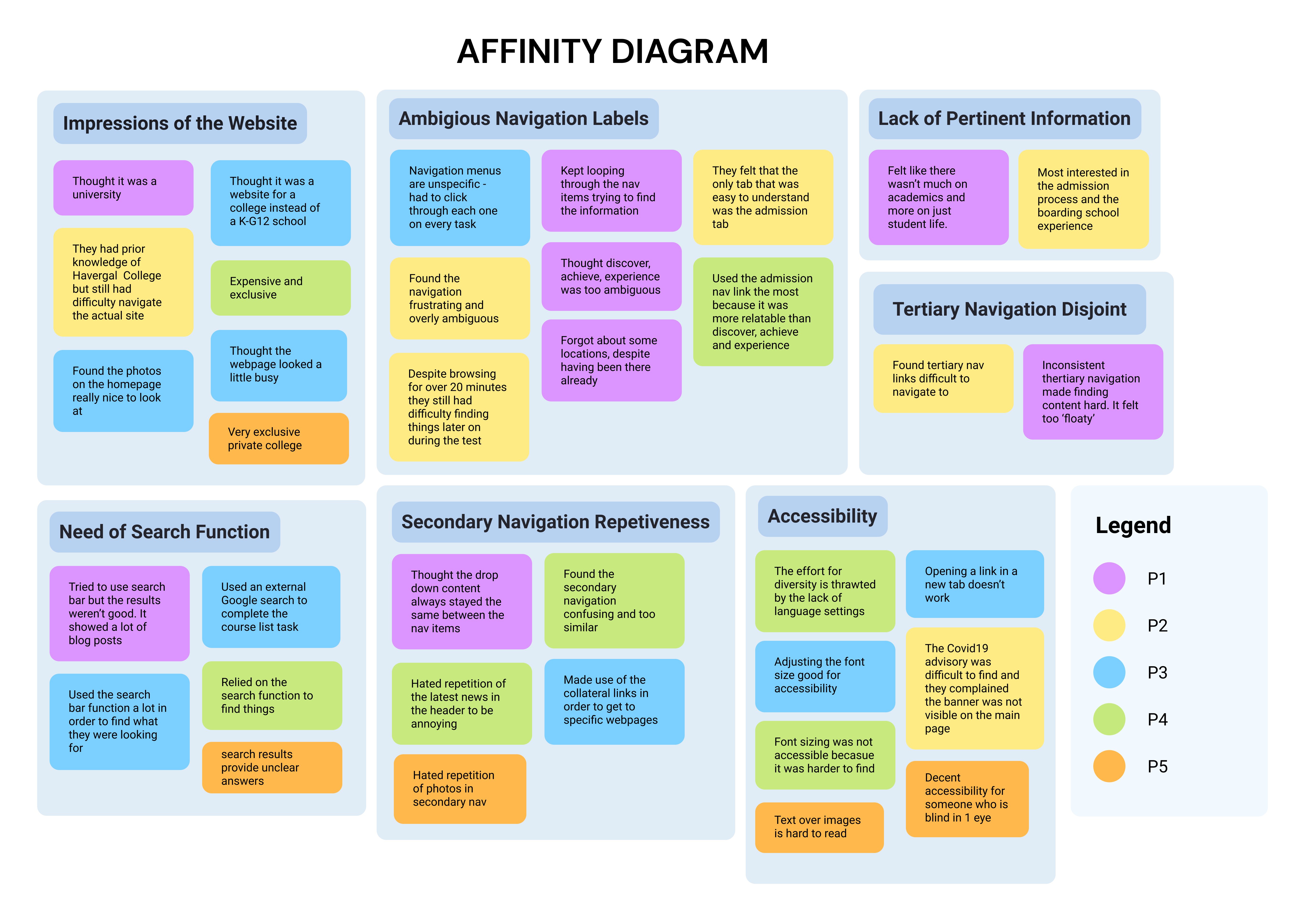
Affinity Diagram for Interviews
The affinity diagram summarizes the highest level problems our participants had with the usability and information architecture of the Havergal website.
1. Ambiguous Navigation Labels
2. Lack of Pertinent Information
3. Repetitive Secondary Navigation
4. Need of a Search Function
5. Limited Accesibility
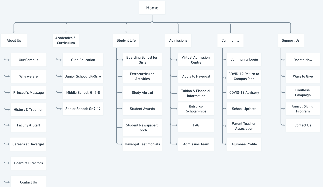
Original Information Architecture Schematic
Heuristic Evaluation
In order to understand out problem space, we looked into articles about productivity, learning, and organizing as a student. We looked at peer-reviewed articles, websites and existing apps to see what others were doing to address the problem.
Content Audit
The content audit was conducted by a web-crawler which graded the Havergal college website against the Flesch-Kincaid readability scale to determine how difficult or easy a passage is to understand for the average user. Havergal got results of:
- 49.9/100 on reading ease where the recommended is between 60 and 70
- 15.3 minutes for average reading time where the recommended is less than 1 minute
This suggests the readability is too difficult for the average user and the pages carry more text than may be attractive to users.
User Needs
Our User Needs were based on the compilation of our data and our affinity diagram
- Secondary navigation headers and drop down lists with language that is easily communicable to the user
- Clear to understand vocabulary throughout the website that a representative user can understand
Card Sorting
In order to tackle the Havergal website’s problem with ambiguous navigation vocabulary, our team conducted both open and closed card sorts in order to ascertain what organization scheme meant most sense to users.
We found that clear and communicable language was what users desired and responded best to.
Content Inventory
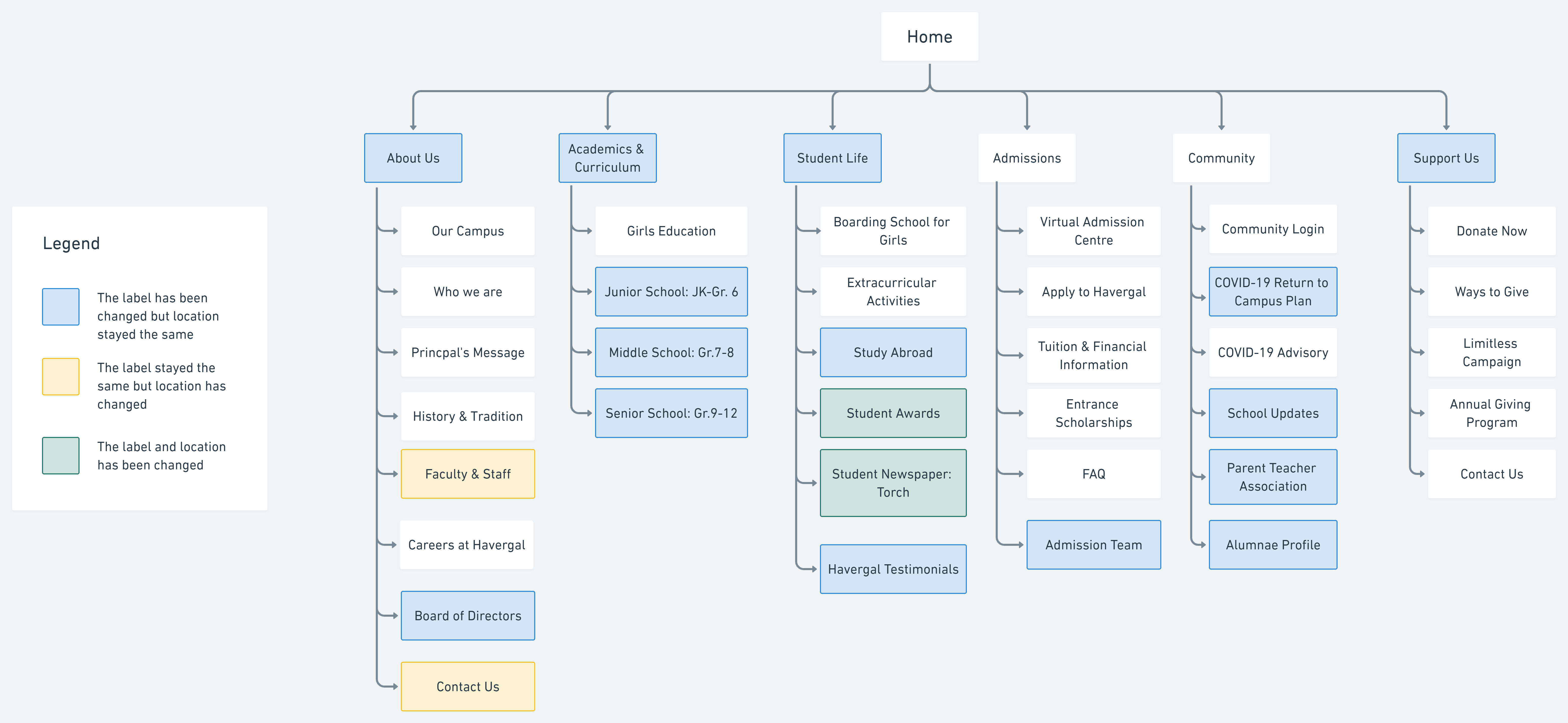
After our card sorts we created charts to represent orginal and the revised information architecture. We revised the secondary navigation in the following way:
- Discover -> about us
- Achieve-> Academics & Curriculum
- Experience -> Student Life
- Admissions-> Admissions
- Community-> Community
- Support-> Support Us
Storyboards
Medium Fidelity Storyboards
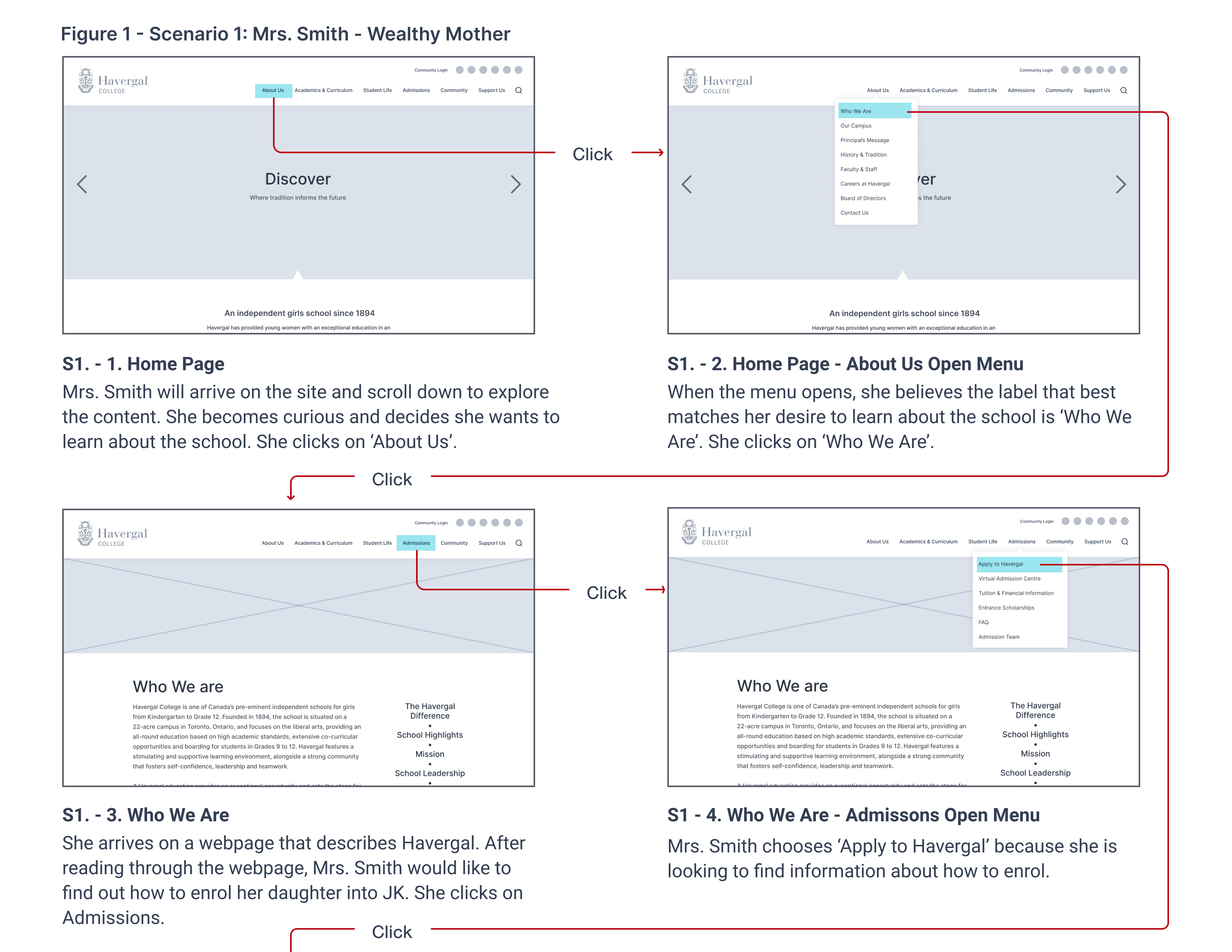
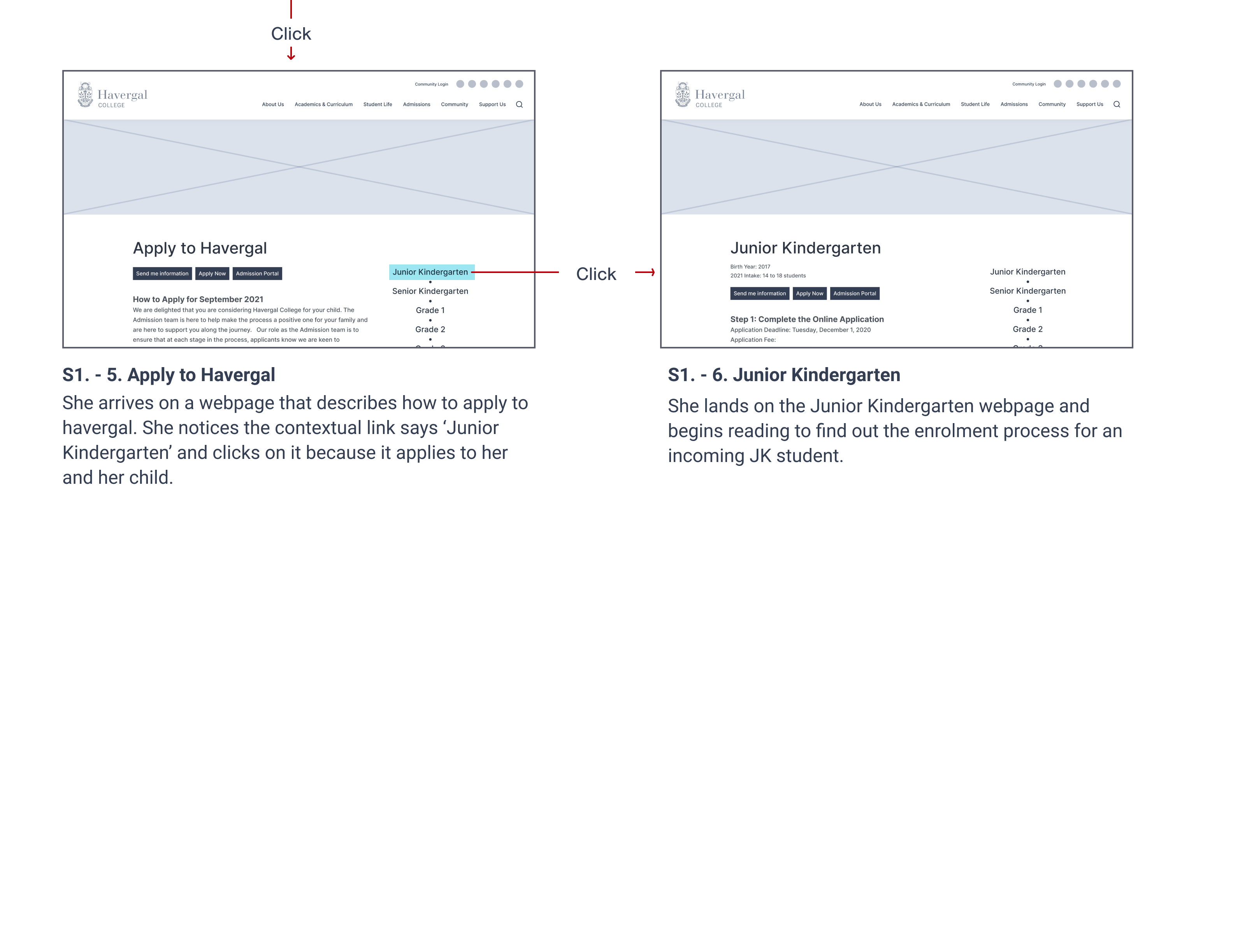
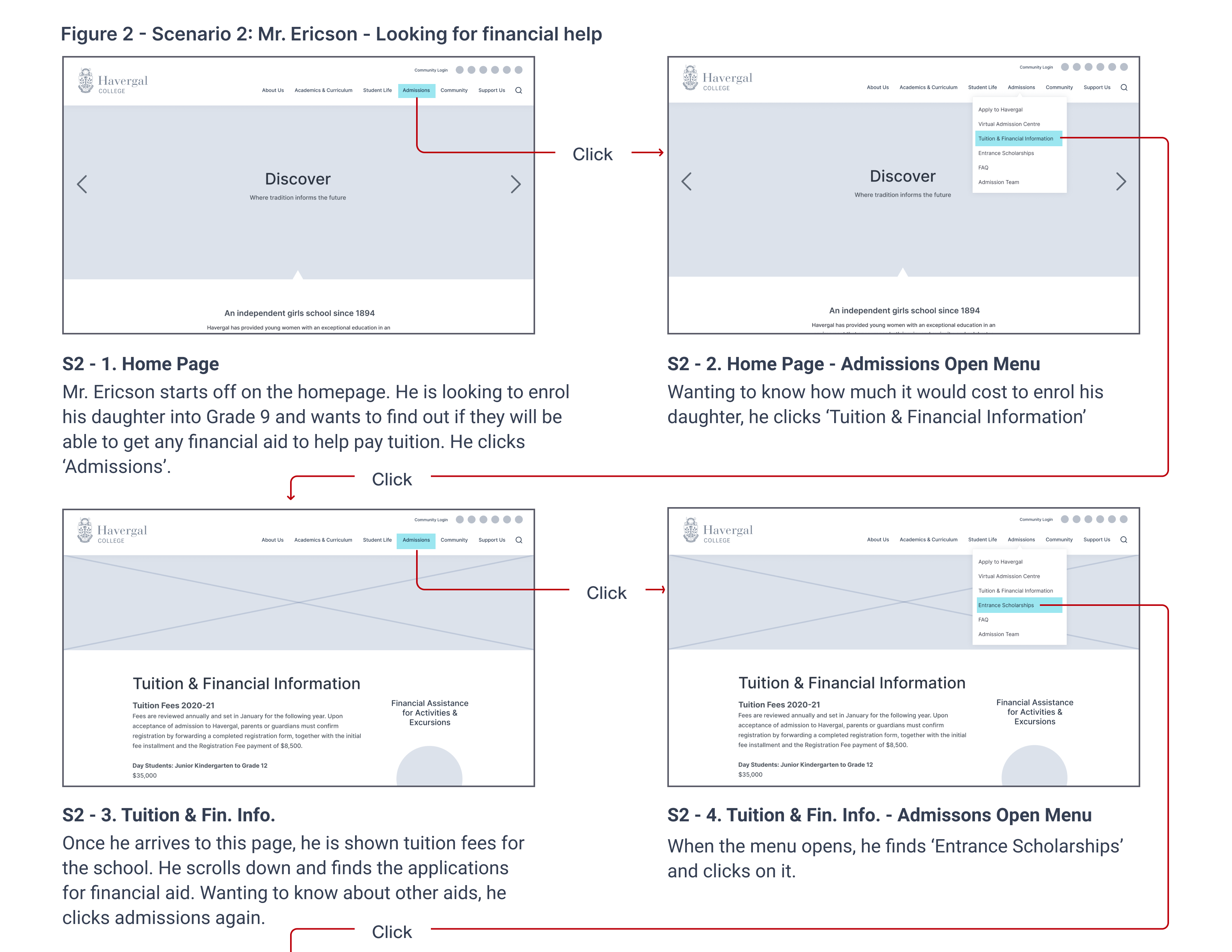
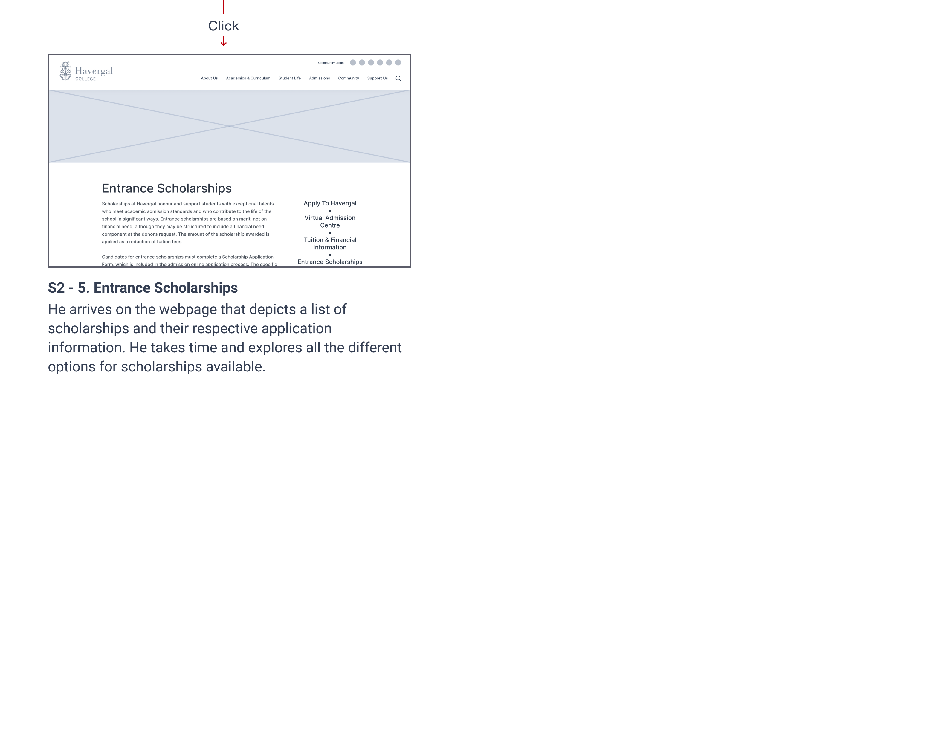
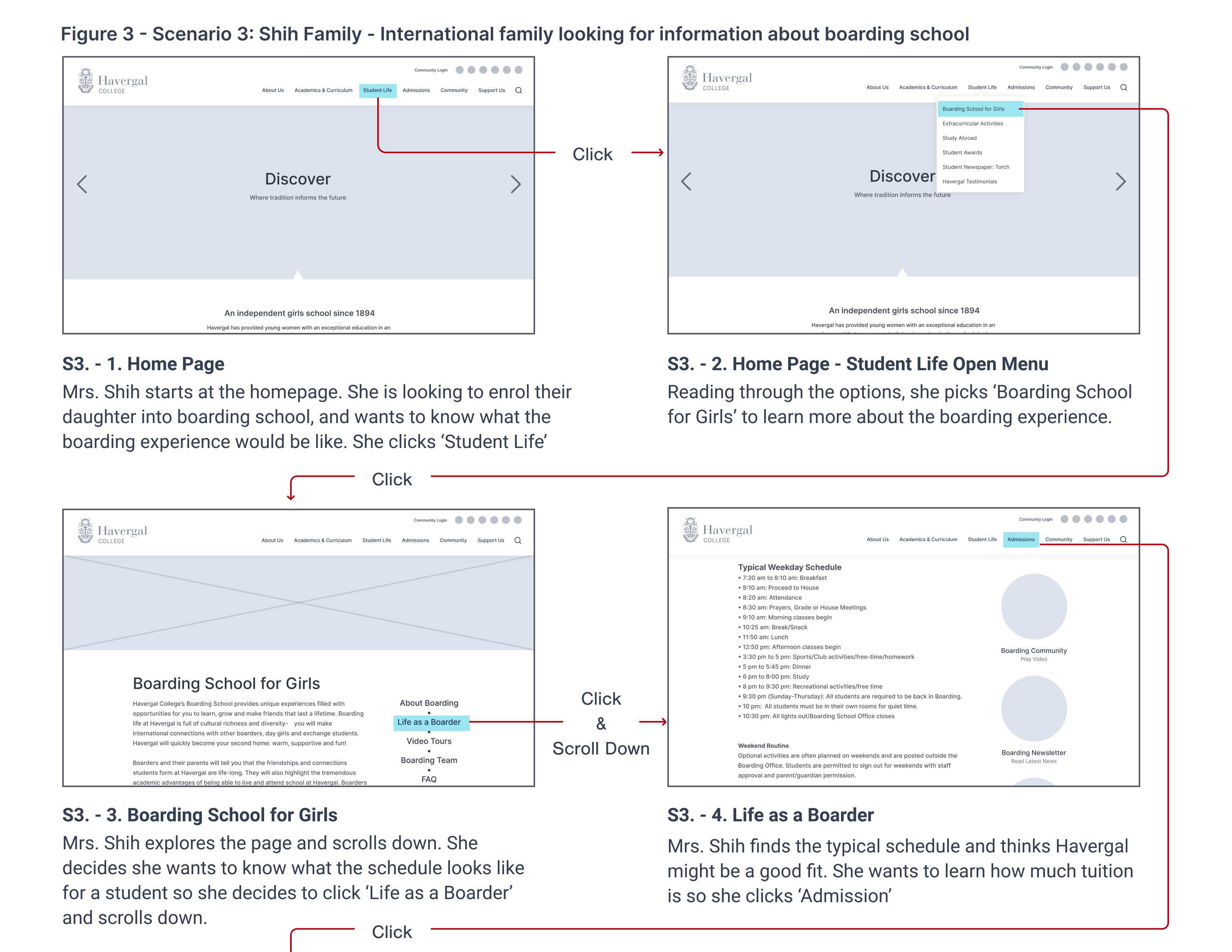
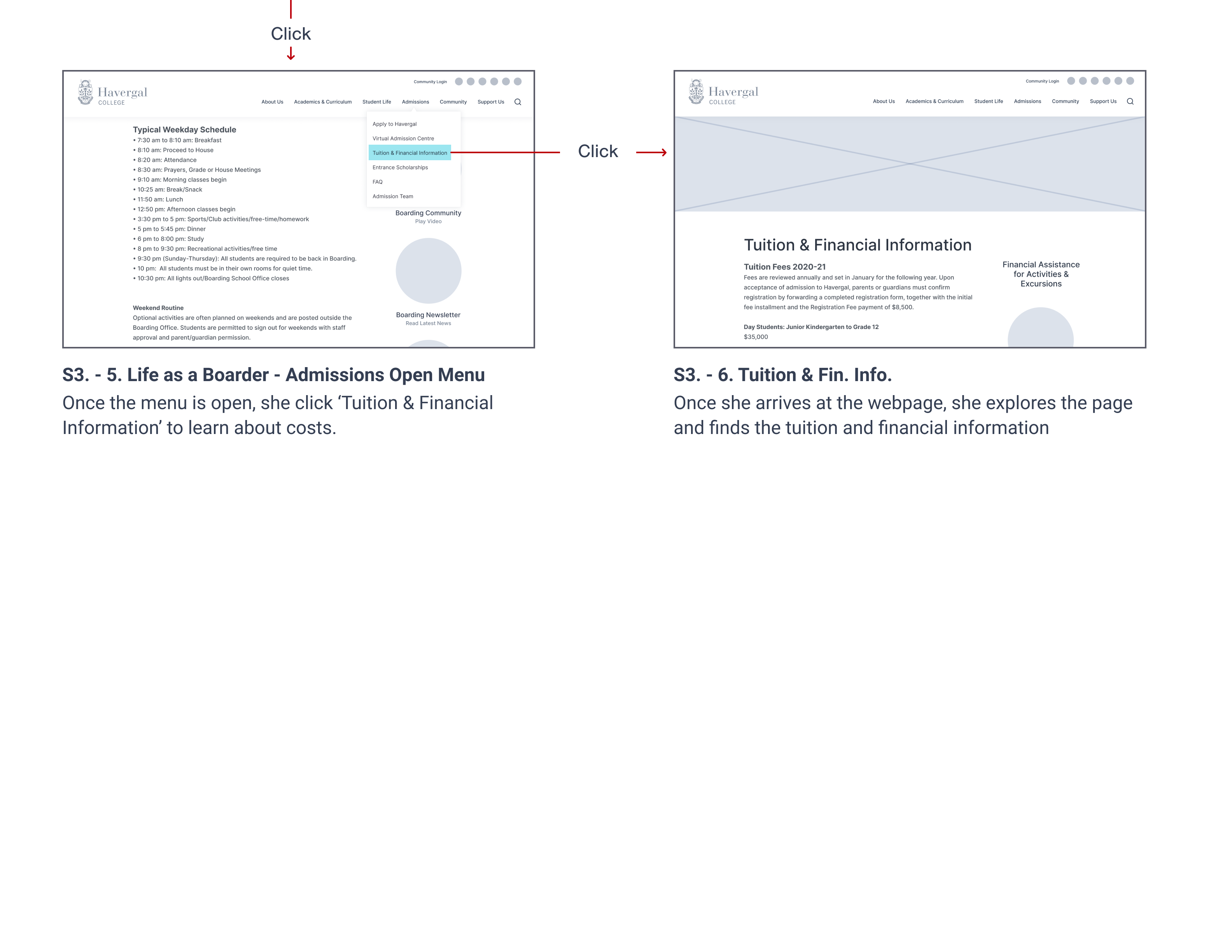
These storyboards illustrate the three user scenarios I created which depict situations representative users would find them in.
1. A parent who wants to understand why Havergal is different from other schools as competition
2. A low income parent looking for financial assistance for their child as well as how much she can potentially receive.
3. An international family who wants to understand how they can enroll their daughter in the boarding program.
Scenario One details an international student wanting to navigate to boarding on the Havergal website.
Scenario Two details a family seeking financial aid on the Havergal website.
Scenario Three details an internationa family looking for information about boarding school
Final Information Architecture Schematic
Based on our research, interviews and card sorting we developed this new and improved IA schematic for the Havergal website.
Next Steps
Based on our results we gathered that we may have to make some changes to common opportunities of improvement which were brought up.
- To do more usability testing with more representative users to see how the new IA and the clickable prototype works for them.
- To get the input of those affiliated with the Havergal College school and to do usability testing with those who are familiar with the old IA to see how it compares.
Selected Works

ODS Work (MRTR)Project type
SproutProject type

Academic BeaversProject type
Havergal College IA RedesignProject type

Cox Automotive ProjectsProject type