Academic Beavers
Academic Productivity App
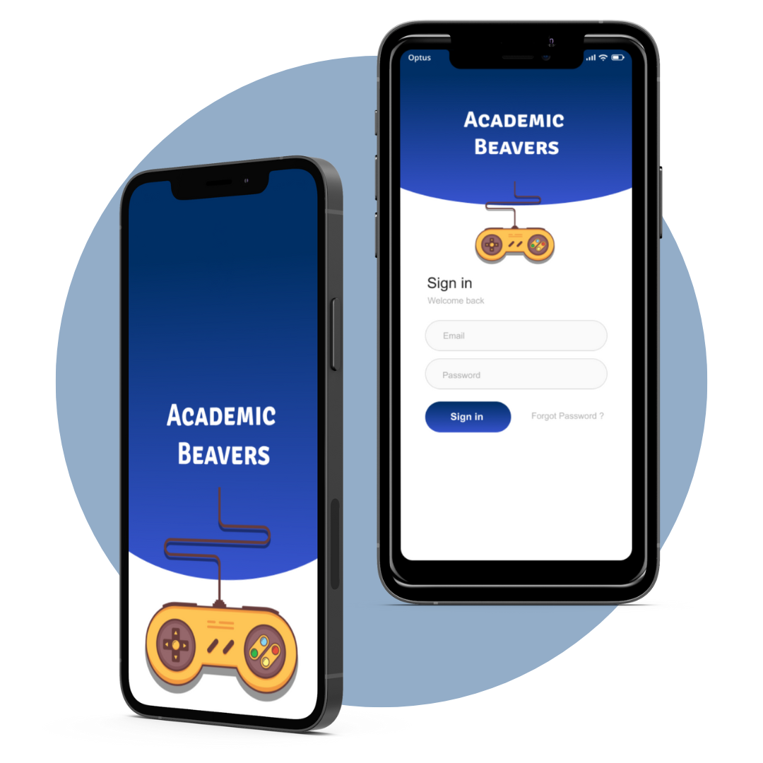
This project was part of my UX Design introductory course where we were given problems surrounding students that we were tasked with solving. When confronted with the unique challenges students have surrounding time management and efficient work we developed a productivity app which aims to make staying on top of tasks fun. This app utilizes gamification features to make productivity as fulfilling as it can be fun.
Problem Space
Role
UX Designer/Researcher
Team
Myself
Lauren Baek
Carla Montgomery-Alexander
Andrei Gulnev
Time & Duration
Fall 2020 (9 Weeks)
The Problem
Productivity can be difficult for UofT students when motivation is low, learning is remote and they find their learning management system is confusing and overwhelming. This leads to difficulties in staying on rack and potentially falling behind in student responsibilities.
The Solution
Our team focused on alleviating pain points, like keeping track of multiple due dates and having important documents in different places by compiling everything into one place on one app that uses gamification as a way to keep students organized.
Research
Secondary Research
Primary Research
In order to understand out problem space, we looked into articles about productivity, learning, and organizing as a student. We looked at peer-reviewed articles, websites and existing apps to see what others were doing to address the problem.
We found that there were not any existing academic productivity apps that relied on gamification and catered to university students.
We used surveys, and semi-structured interviews to understand how students managed their studies and what organizational methods they used. We aimed our study at university students, undergraduate or graduate, and catered towards University of Toronto students. We wanted to understand what worked for them, what did not work, how they felt about their current productivity process and pin down the pain points of their current experience.
Design
Ideation
After compiling all the data from our research stage, we drafted an affinity diagram to tease out the key themes and overlap we discovered. Through this overlap, we developed persona, Sid Morrison, a graduate student who is balancing a part-time job, full time school and struggles with balancing their school work. They became representative of the UofT student and their typical responses to managing their productivity.
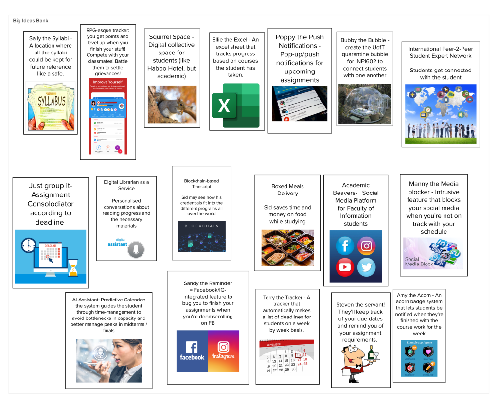
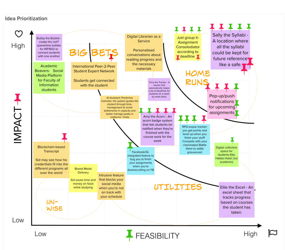
We tinkered away and brainstormed ideas based on the needs and pain points for our users. This ideation phase resulted in ideas both big and small, absurd and not so absurd but we ranked everything according to feasibility and impact on our prioritization grid.
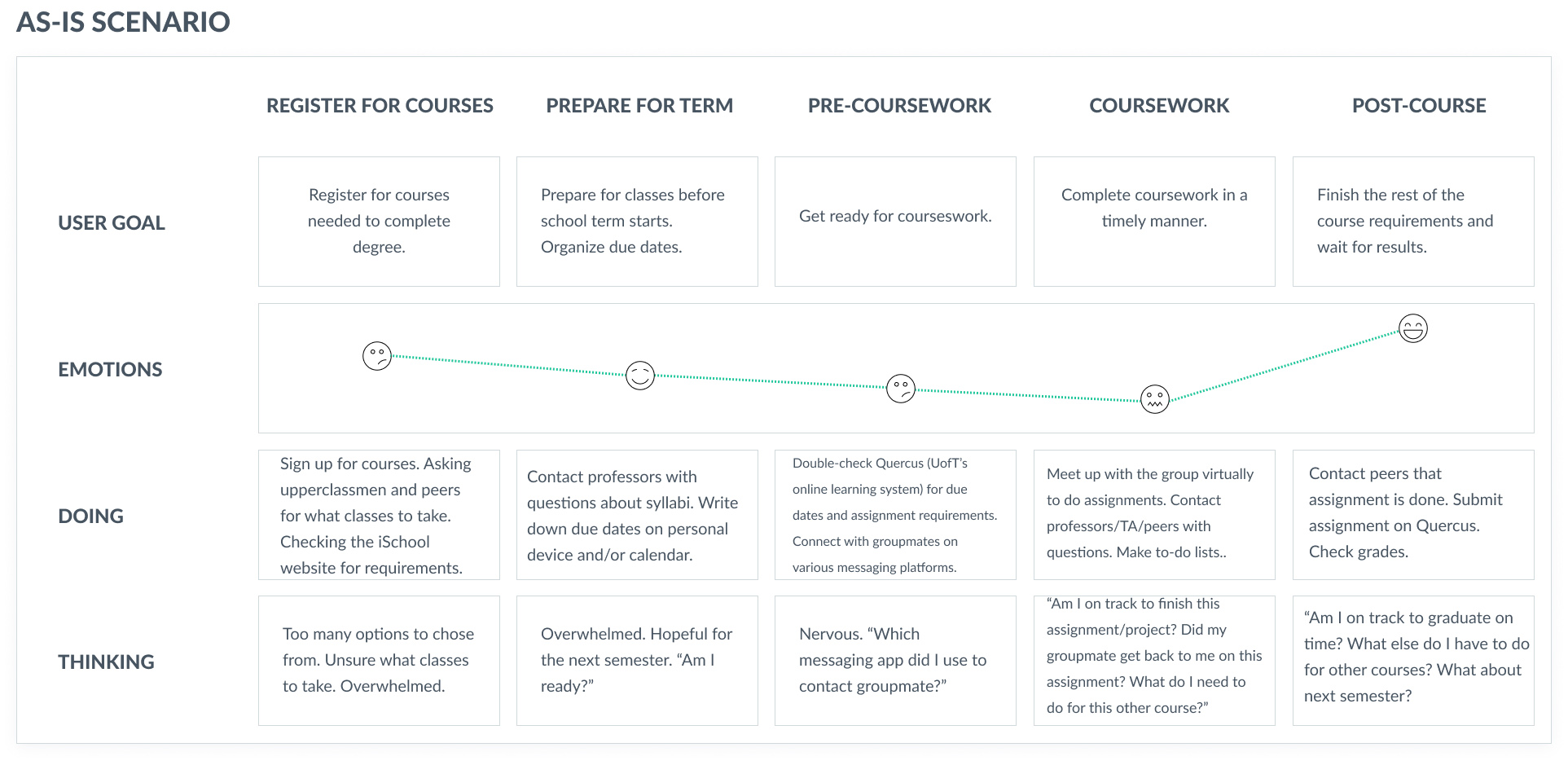
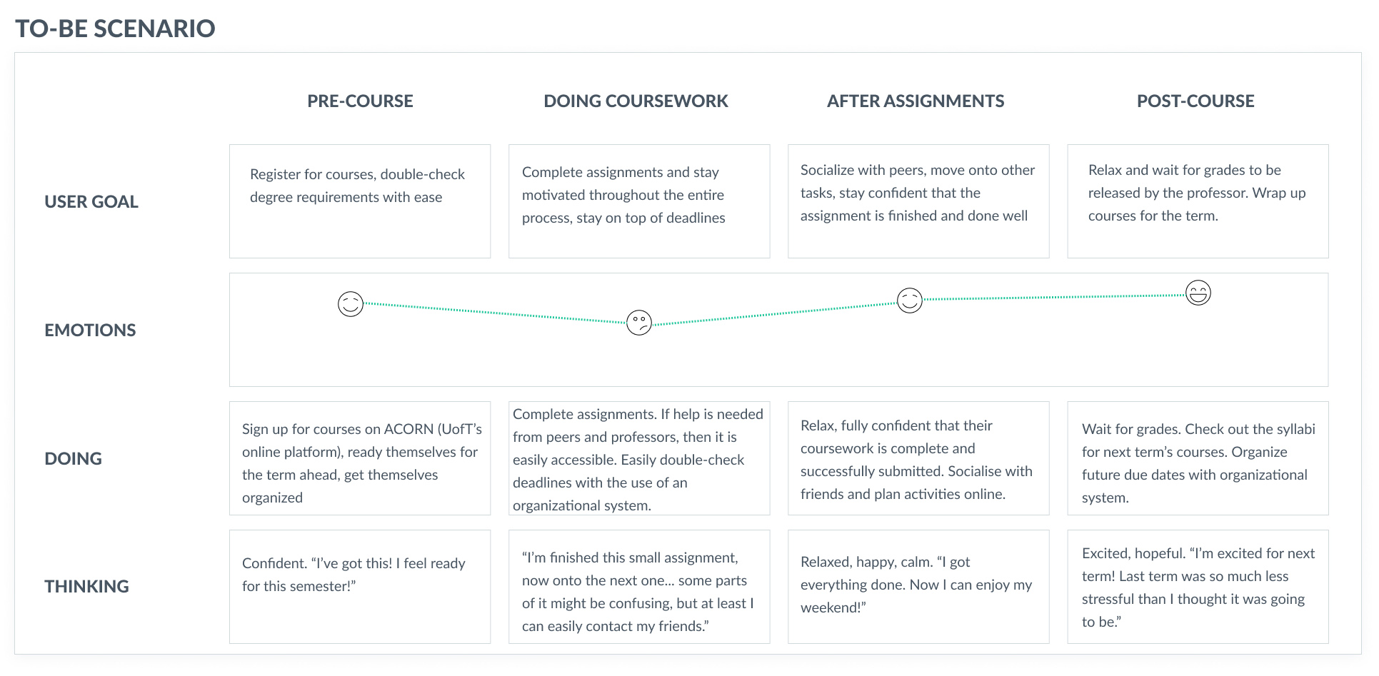
Ultimately, we created a persona, empathy map, and an as-is scenario demonstrating Sid's current experience. This design phase allowed us to develop and hone in on our user's goals and pain points.
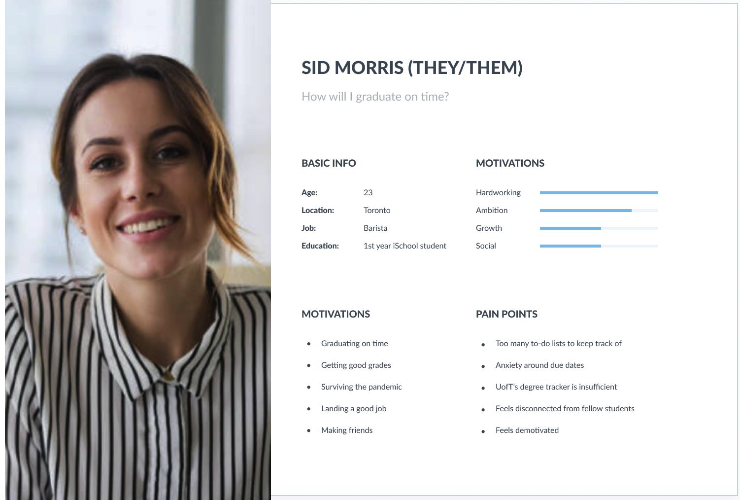
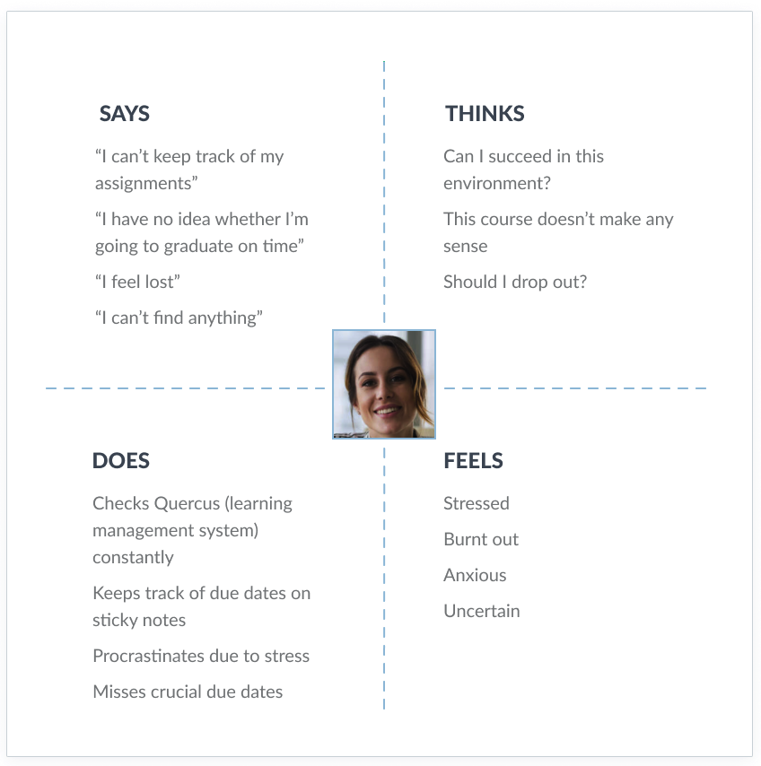
Ultimately, we created an as-is scenario demonstrating Sid's current experience and a to-be scenario to visualize what an improved experience would look like. This design phase allowed us to develop and hone in on our user's goals and pain points.
We tinkered away and brainstormed ideas based on the needs and pain points for our users. This ideation phase resulted in ideas both big and small, absurd and not so absurd but we ranked everything according to feasibility and impact on our prioritization grid.
Prototyping
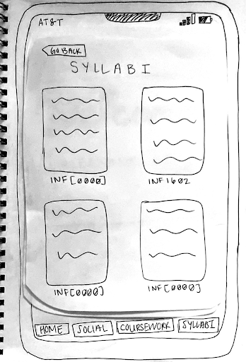
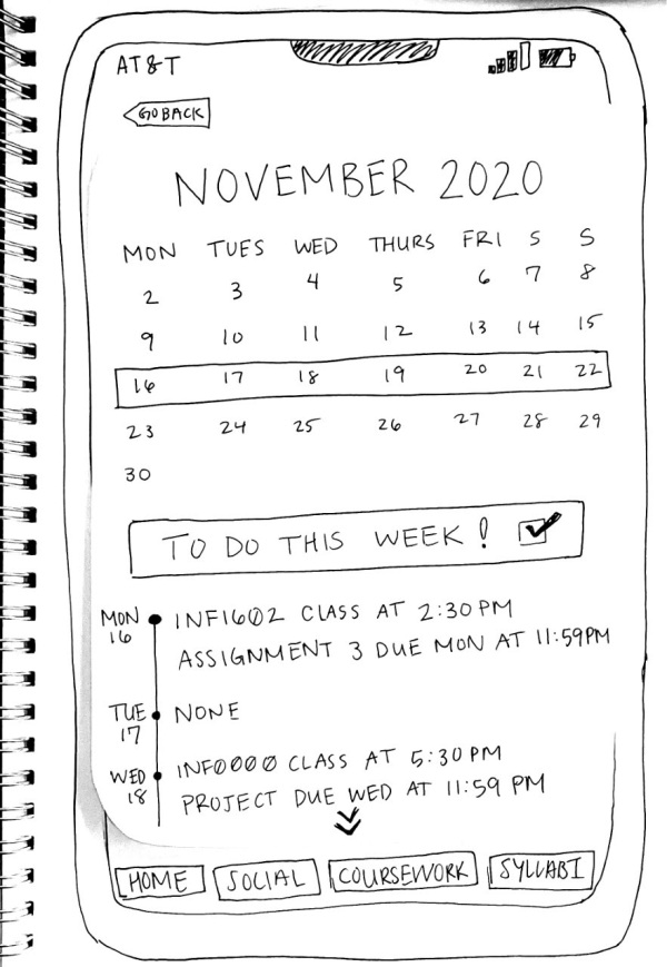
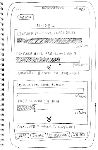
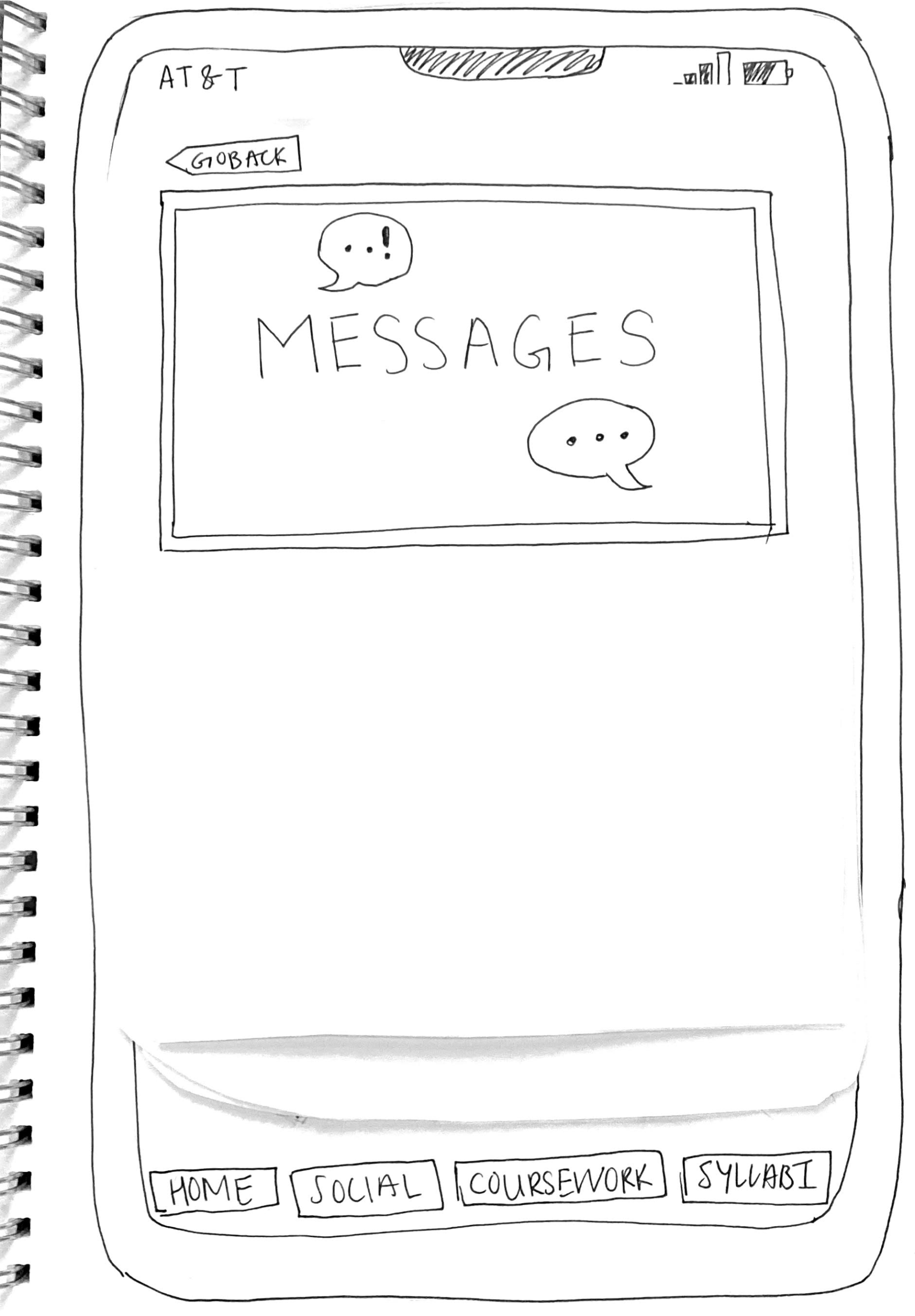
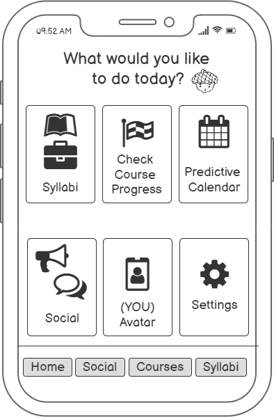
We began with Low Fidelity wireframes and decided on five key features:
- Syllabi Repository
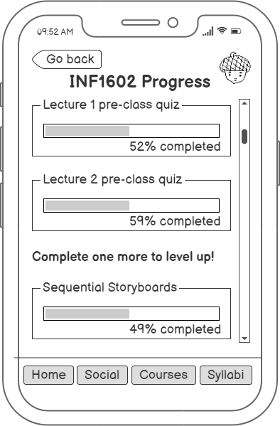
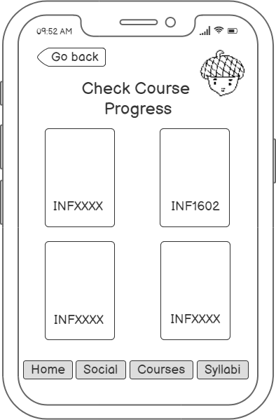
- Course progress tracker
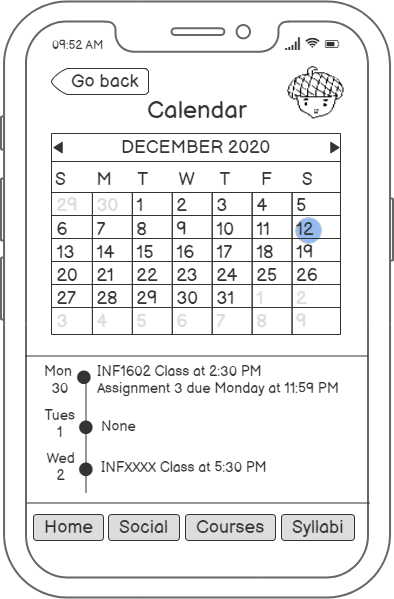
- Predictive Calendar
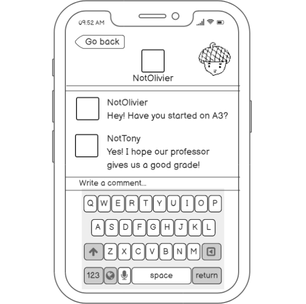
- Messaging system
- Customizable Avatar
After deciding upon these key features we drafted sklow fi sketches that displayed key frames.
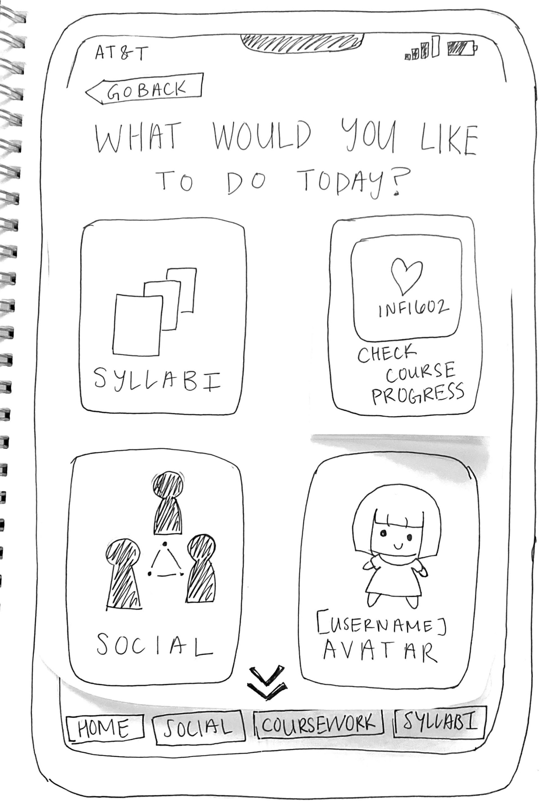
Afterwards we set to work on the medium fidelity frames.
Usability Testing
After our lo-fi and mid-fi wireframes we conducted usability tests based on our mid-fi wireframes to see what additional iterating was necessary.
We asked our users to complete four tasks which highlights the features of our app where we observed their process, listened to their comments via the think aloud approach as they navigated the app. Afterwards, we had an exit questionnaire to which we gathered qualitative data on their experiences with our app.
- Use the chat function to message another student
- Use the check course progress function to see how your tasks are coming along
- Find the syllabus for a specific course (INF1602)
- Find the next due date for a specific course (INF1602)
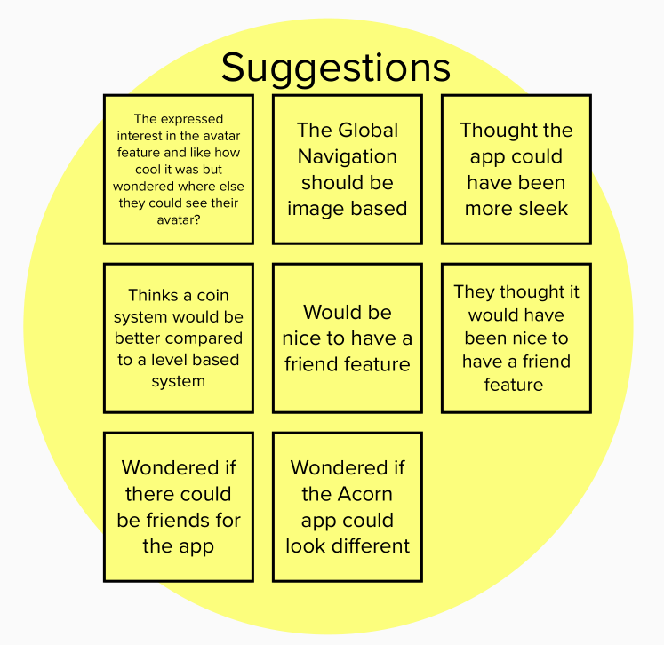
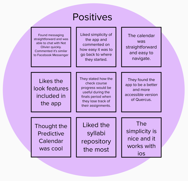
We used the feedback we were given from our users to create an affinity diagram which kept stock of suggestions, questions, similarities to other apps and things they liked about the app.
Our visual summary of our findings can be found below:
Next Steps
Based on our results we gathered that we may have to make some changes to common opportunities of improvement which were brought up.
- The avatar feature could be utilized more and made more interactive to better evoke aspects of gamification in our app.
- The navigation buddy could also be utilized more in order for it to have more of an impact
- There were many connections drawn to University of Toronto’s learning management system and the app would have to differentiate itself more to better stand out.
Selected Works

ODS Work (MRTR)Project type
SproutProject type

Academic BeaversProject type
Havergal College IA RedesignProject type

Cox Automotive ProjectsProject type